Imeson Port Center
Jacksonville, FL
Chalmers Property Co. has long been synonymous with excellence and familial values in real estate development. With over three decades of success, the company has established a reputation for integrity and reliability. The explanation to Jacksonville, FL created an opportunity to develop a new identity that honors their legacy while resonating with the local culture and fostering a sense of community within their industrial warehouse spaces.
Chalmers Property Company
2023
Research, Opportunity Assessment, Creative Direction, Concept Development, Design Development and Visual Identity
Industrial
Familial Unity and Community Building
The Chalmers Property Co. brand centers on the idea of family. We aimed to make tenants feel part of a larger family, not just occupants.
01
Flexibility and Simplicity
The visual brand identity is versatile and adaptable, ensuring it integrates smoothly with tenant logos and branding materials.
02
03
Industrial Innovation and Tradition
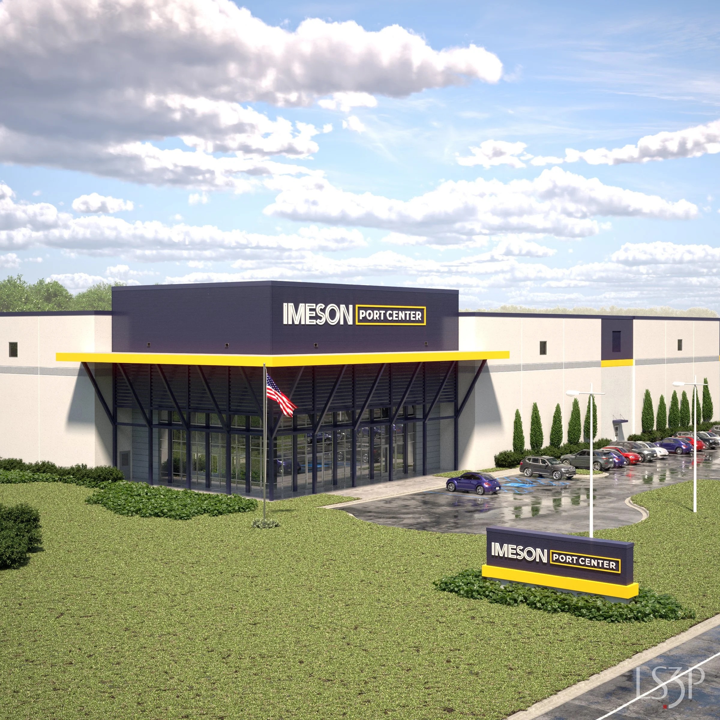
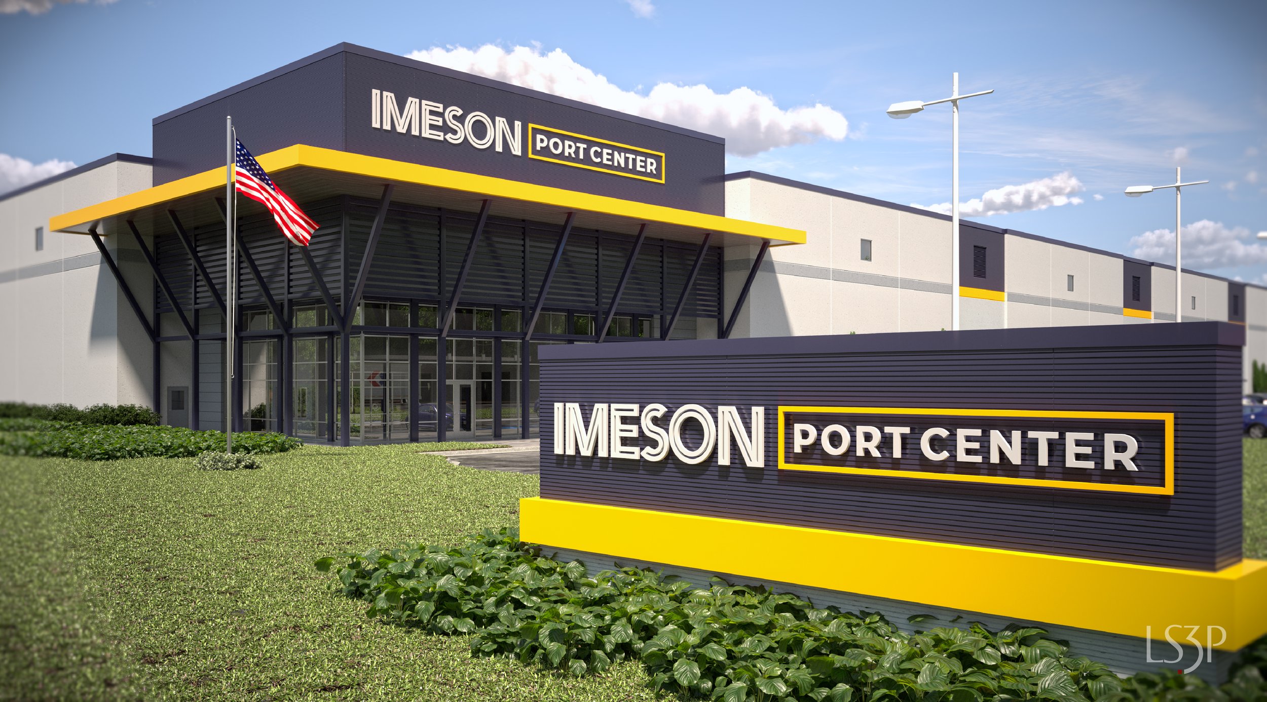
The design balances industrial aesthetics with innovation, reflecting Chalmers Property Co.'s legacy of excellence and modern approach to real estate.

JACKSONVILLE'S CULTURAL LANDSCAPE
Jacksonville is a city marked by its rich history, diverse population, and burgeoning economic sectors. The city's industrial base is an integral part of its economic fabric, and its community values are deeply rooted in local relationships and collaborative spirit. Understanding this, the brand needed to reflect both Jacksonville's industrial identity and its welcoming, community-oriented culture.
INDUSTRIAL WAREHOUSE CONTEXT
The industrial warehouses in Jacksonville serve as hubs of activity, where efficiency and functionality are paramount. However, these spaces also offer an opportunity to create environments where people can feel connected and valued. Research into tenant experiences highlighted the need for a brand that could humanize these spaces and foster a sense of belonging.
Building Context
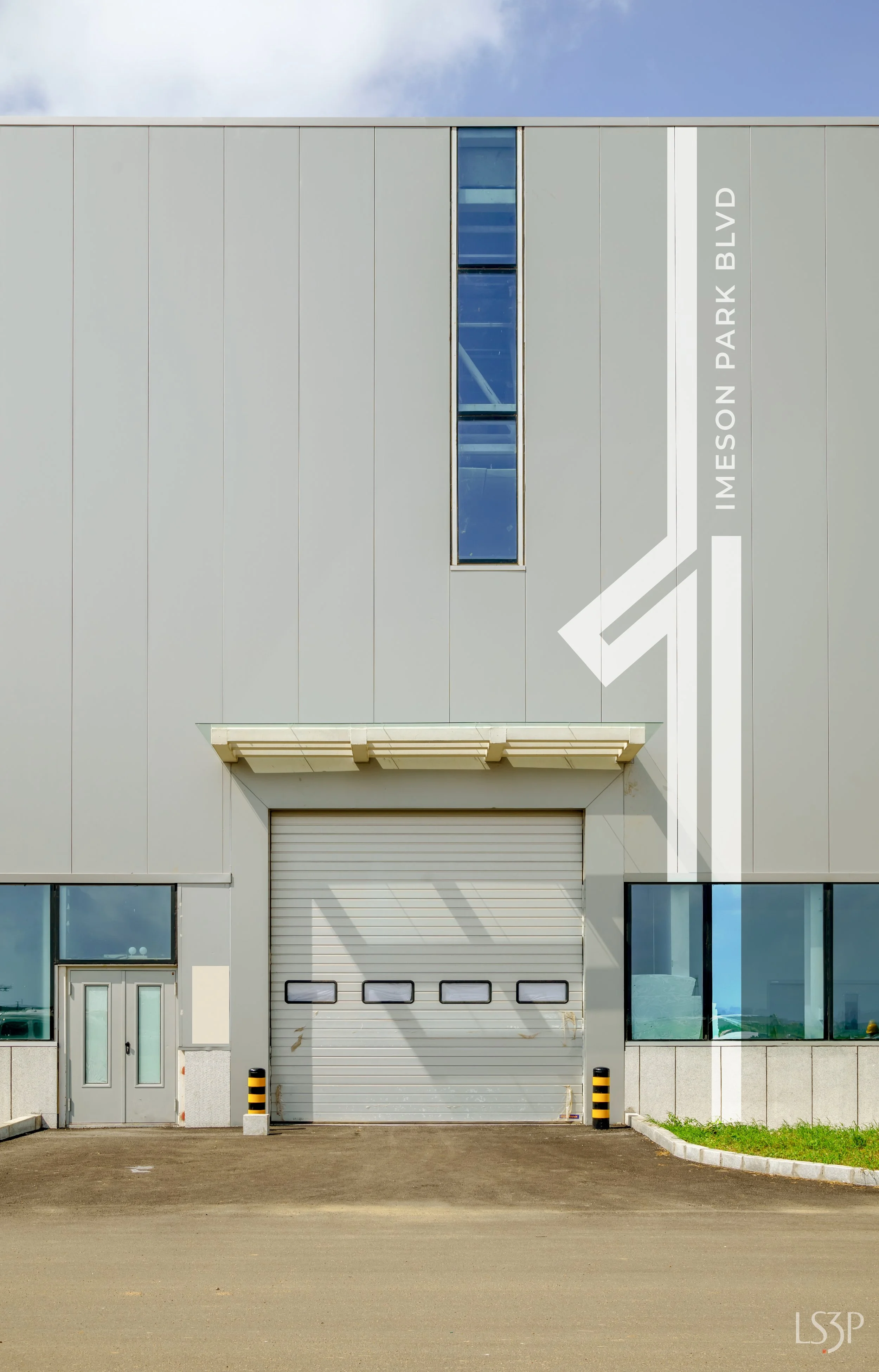
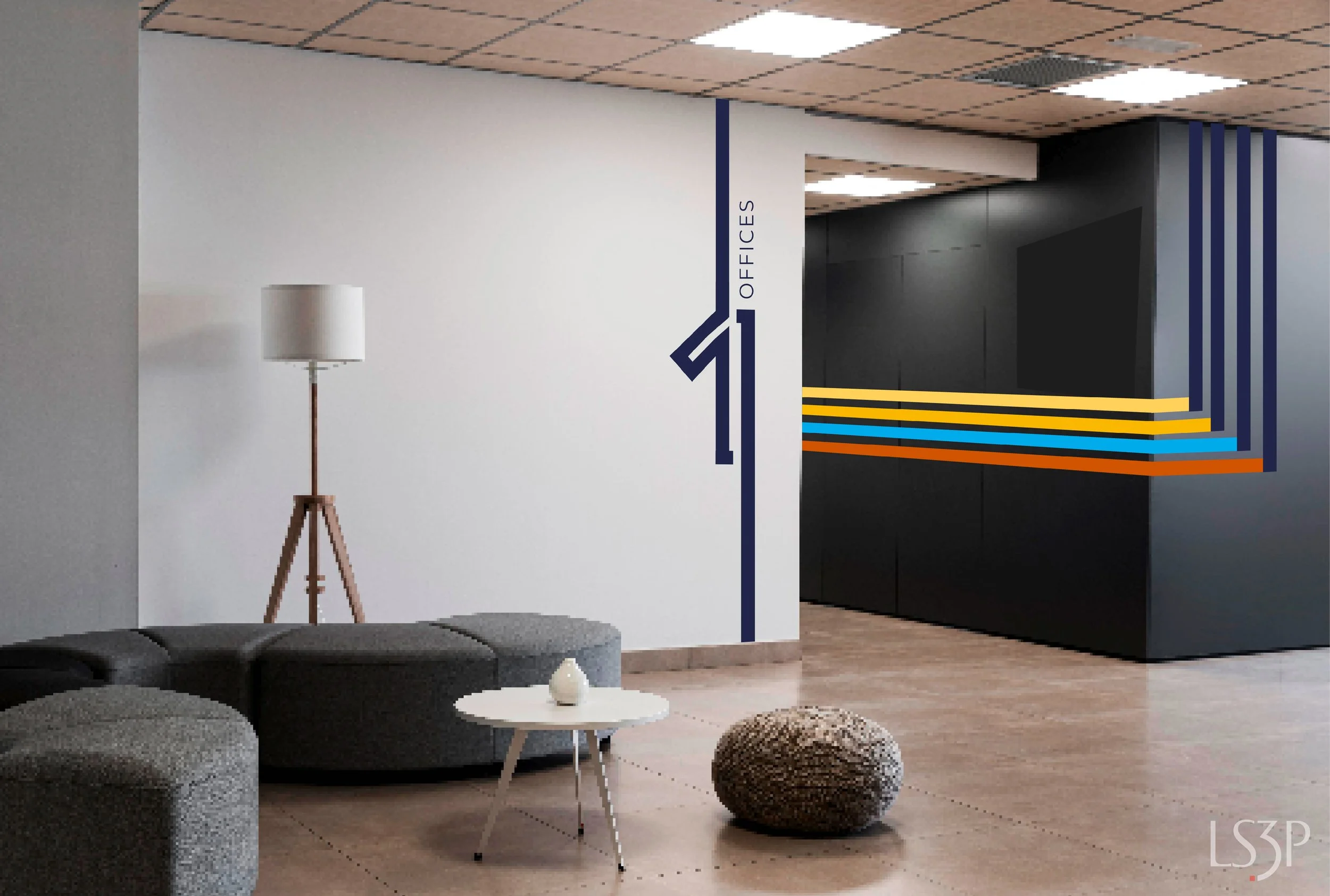
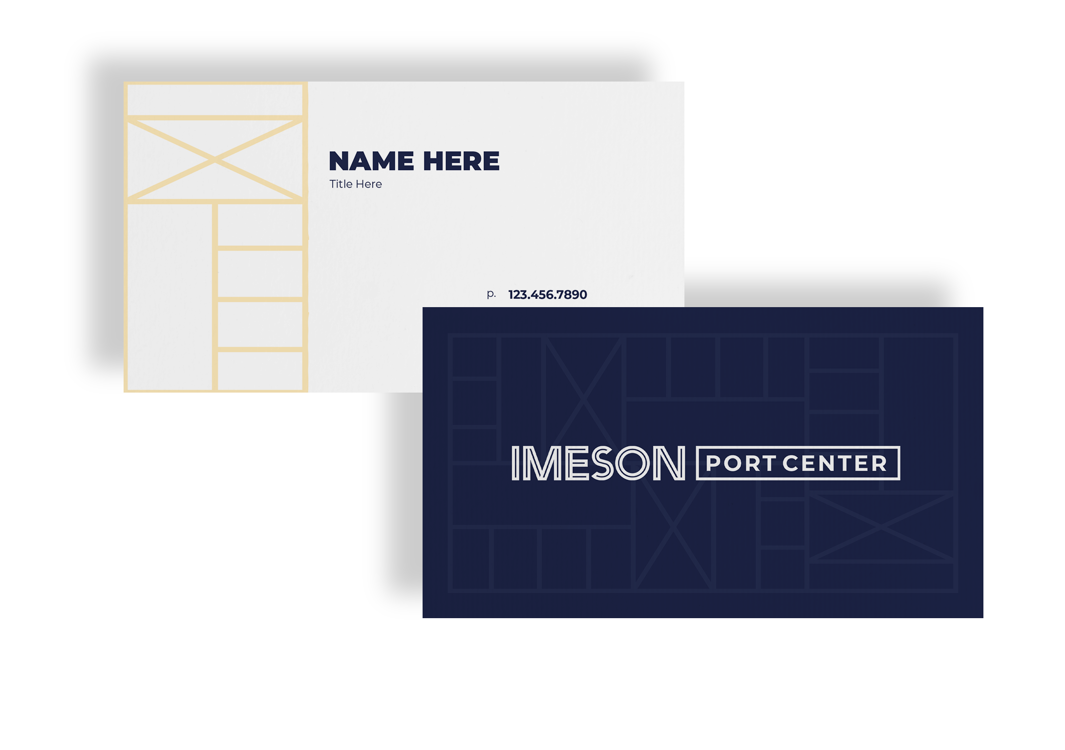
We developed a closed rectangle emblem and custom typeface that symbolize unity and connection within the warehouse spaces. The closed contour line of the emblem reflects ongoing familial connections and the sense of community, while also nodding to the traditional large rectangular facades typical of industrial spaces.
Design Solutions
REFLECTION
The Chalmers Property Co. branding project represents a successful fusion of tradition and innovation. By integrating familial values with industrial design, the brand identity not only differentiates Chalmers Property Co. from competitors but also fosters a sense of community within their warehouse spaces. The new visual identity is a testament to the company’s commitment to excellence, integrity, and the creation of welcoming environments in Jacksonville.
Work performed while employed by Catapult[13] as a Graphic Designer


